lilgpMonitor User's Manual
1.1 Introduction
lilgpMonitor is a companion utility for lil-gp that
allows you to monitor the run-time progress of lil-gp
experiments. It provides you with a mechanism to easily plot various
genetic programming metrics such as mean standardized fitness, mean
tree size, etc. After selecting a lil-gp statistics file, you
may plot up to two curves on the same monitor using a variety of
scaling techniques and line styles. You also have the ability to plot
statistics for either the entire population or specific
sub-populations. Several monitors can be used to simultaneously
observe the trends of several genetic programming metrics. At the end
of the experiment, the graphs can be saved in a GIF format, allowing
them to be easily imported into word-processing documents.
If you are unfamiliar with genetic algorithms, genetic programming, or
lil-gp, then you should begin by reading the lil-gp User's
Manual.
1.1.1 Features
lilgpMonitor features
include:
- Comparative Analysis: able to have several monitors open
simultaneously, each plotting up to two GP metrics
- Useful: graphs can be exported as GIF files for easy import into
word processors
- Timed updates: automatically re-reads statistics file and updates
graphs at regular intervals
- Manual updates: can manually control graph updates
- Intelligent scaling function: automatically calculates 'nice' tick
placements on the y-axis
- User specified scales: accepts maximum y-axis values from user
- Independent scale selection: plot metrics using independent scales
- Dependent scale selection: plot metrics using the same scale
- Sub-population support: Point and click selection of
sub-population statistics
- Line styles: different line styles available
- Help: linked to on-line help system
1.1.2 Limitations
lilgpMonitor is capable of plotting all of the statistics
generated by lil-gp, including the ability to plot statistics
for specific sub-populations. In that regard, there are no
limitations. However, there are limitations with respect to Java.
Unfortunately, Java is slow, executing at about 1/20th the
speed of compiled C code [Fla96]. This is especially evident when
reading large statistics files. For example, loading a file
containing statistics for a 50 generation experiment with 5
sub-populations takes approximately 15 seconds on a Sparc20 with 64Mb
RAM. There is hope; Sun claims that the performance of Java
byte-codes converted to machine code is nearly as fast as native C or
C++[Fla96].
The current version of lilgpMonitor does not perform any data
manipulation such as smoothing. As a result, data sets containing
localized spikes that are several orders of magnitude larger than the
average trend cause curves to appear 'flat' when plotted. However,
since the user has control over the maximum value for the y-axis,
there is some mechanism for producing useful information in these
cases. This may or may not be considered a limitation.
1.1.3 Author
This software was written by Ryan Shoemaker under the direction of
Dr. William Punch. Other companion utilities for lil-gp have
been developed by Ryan Shoemaker and Dave Guyette as part of a joint
project.
Comments and suggestions may be sent to:
shoema16@cps.msu.edu
punch@cps.msu.edu
Department of Computer Science
3115 Engineering Building
Michigan State University
East Lansing, MI 48824
USA
1.2 Getting Started
When you unpack the distribution, you should get
this directory tree:
lilgpMonitor/
    classes/         (byte-code files)
    docs/            (documentation files)
        images/      (image files used in documentation)
    javadocs/        (source-code documentation files)
        images/      (image files used in source-code documentation)
    src/             (source-code files)
Before using lilgpMonitor, you must have Java JDK 1.02
installed on your system. To generate the .class files, change into the lilgpMonitor/src directory and type:
javac -d ../classes *.java
To run lilgpMonitor, simply change into the lilgpMonitor/classes directory and type:
java lilgpMonitor
If you are running the utilities under Windows95/NT, you will have to
modify the paths in the above commands and also add the lilgpMonitor/classes directory to your CLASSPATH in place of the dot
directory ".".
This is version 1.0 of lilgpMonitor. Updates and information
related to lilgpMonitor can be found on the World Wide Web at
http://isl.cps.msu.edu.
1.3 The Main Window
The only window in lilgpMonitor is shown in Figure 1. This
section will give a brief overview of the options available and the
next section will give detailed explanations of each feature.
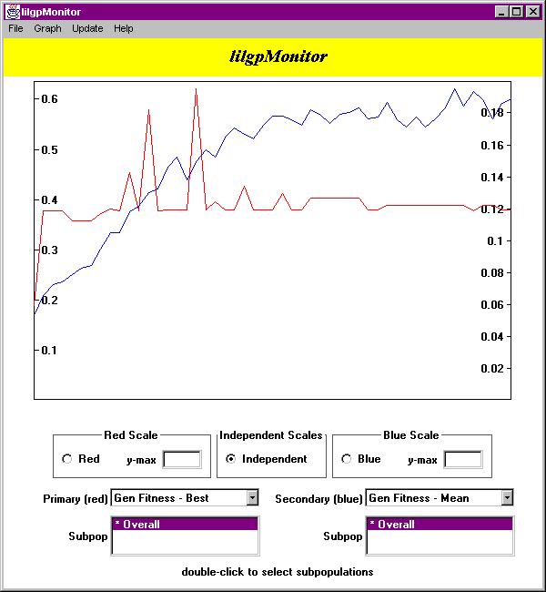
Figure 1 - The Main Window
As you can see, there are four menus available in the menubar at the
top of the window. From the File menu, you may open a
statistics file, save your graph as a GIF file, create a new monitor,
close the current monitor, or close all monitors. From the
Graph menu, you may select a line style for the curves. The
Update menu has options for selecting either manual updates or
automatic timed updates. Finally, the Help menu provides
access to the on-line help system and also information about the
author and version of lilgpMonitor that you are using.
The actual graph sits in the middle of the window, with all of its
controls along the bottom. In Figure 1, there are two curves on the
graph, each with its own scale. The red scale appears on the left
axis, while the blue scale appears on the right axis. The various
controls on the bottom of the widow allow you to select a scale, the
maximum scale values, and the GP metrics and sub-populations you want
to plot.
1.4 Feature Descriptions
The features listed in this section apply only to the monitor in which
you make the selection. For example, changing the automatic update
interval to five minutes in one monitor will have no impact on the
settings in any other monitors that are currently open or any monitors
that are opened at a later time.
1.4.1 The File Menu
The File menu lets you perform file operations and
create/destroy monitors.
- Selecting Open causes a file dialog to appear. Simply
select the statistics file that you are interested in and it will be
opened.
- Selecting Save As also causes a file dialog to appear.
Simply supply a file name and the graph will be converted into GIF
format and saved.
- Selecting New Viewer will create a new statistics monitor
that contains all of the same features as the original monitor that
you opened.
- Selecting Close Viewer will destroy the current monitor.
Any other monitors that are currently open will remain open.
- Selecting Exit All will destroy all of the monitors that
are currently open.
1.4.2 The Graph Menu
The Graph menu lets you select the line style
you would like to apply to the curves.
- Selecting Lines will cause the curves to be plotted using
line segments to connect the data points, as shown in Figure 2.
- Selecting Lines + Points will cause the curves to plotted
using line segments to connect the data points, but will also draw a
small diamond indicating the actual positions of the data points on
the curve, as shown in Figure 3.
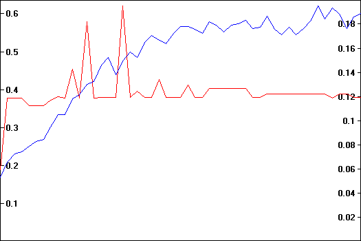
Figure 2 - Lines
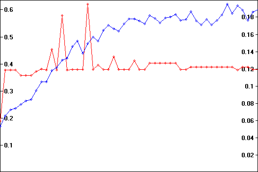
Figure 3 - Lines + Points
1.4.3 The Update Menu
The Update menu lets you select the timing of graph updates.
- Selecting Manual Updates/Update Now does two things.
First, is stops the automatic update timer if it is currently set.
Second, it reads the contents of the statistics file and refreshes the
graph immediately.
- Selecting any of the update intervals sets the timer to update the
graph automatically. For example, selecting 5 Minutes will
cause the monitor to re-read the statistics file and refresh the graph
every five minutes.
1.4.4 The Help Menu
- Selecting Help provides access to the on-line help system.
- Selecting About provides information about the version of
lilgpMonitor that you are using.
1.4.5 Selecting a Scale
Below the graph, there are three boxes labeled 'Red Scale',
'Independent Scales', and 'Blue Scale.' These controls
allow you to choose which scales to use and specify maximum scale
values.
The default setting for the scale is Independent
Automatic scaling. This means that lilgpMonitor will
examine the data set and determine the best scales to use when
plotting the curves. Figure 4 shows the result of using this
combination of settings. In this case, the red curve is plotted using
the scale on the left axis, while the blue curve is plotted using the
scale on the right axis. These curves are plotted using
independent scales. Since there are no values supplied in the
y-max fields, lilgpMonitor automatically selects values
that will allow the entire data set to be visible within the graph -
this is automatic scaling. These settings are useful when you
would like to view two GP metrics that are unrelated
(i.e. standardized fitness versus tree size).
Figure 4 - Independent Autoscaling
By clicking on either the 'red' or 'blue' checkboxes,
you will be selecting a dependent scaling mechanism with
automatic scaling. This means that lilgpMonitor will
apply the selected scale to both curves. Figure 5 shows the red scale
being applied to both curves, while Figure 6 shows the blue scale
being applied to both curves. These settings are useful when you
would like to compare two GP metrics that are related
(i.e. standardized fitness of sub-population 1 versus standardized
fitness of sub-population 2). Looking back at Figure 4, you can see
how it can be difficult to determine the relationship between two GP
metrics when using Independent Autoscaling. It isn't until you
examine Figure 5 where Dependent Autoscaling is used that you
can clearly see the relationship between the two curves. Since the
blue curve falls below the red curve in every generation, the red
curve is not visible when Dependent Autoscaling is set on the
blue curve in Figure 6.
Figure 5 - Red Dependent Autoscaling
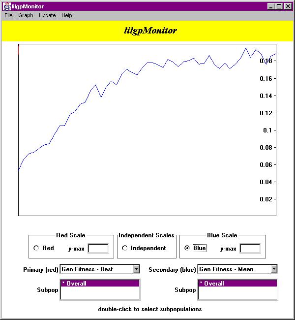
Figure 6 - Blue Dependent Autoscaling
By changing the values in the y-max fields, you are selecting
manual scaling. It is possible to have manual scaling
active for one curve and automatic scaling active for the other
curve by supplying a value for y-max in only one of the
textfields. It is important to understand that when you select
manual scaling, you are not actually specifying the scale of
the curve, per se, but rather the maximum value that will be
used to in determining the scale. For example, specifying a
y-max value of 0.5 for the red curve will cause it to truncate
the top of the tallest spikes as shown in Figure 7.
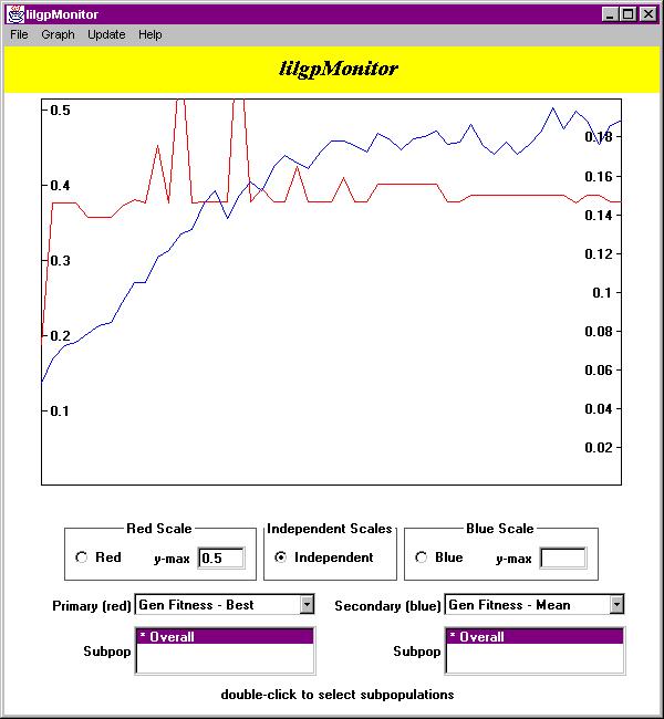
Figure 7 - Independent Manual Scaling
1.4.6 Selecting the GP Metrics
Below the scale selection boxes, there are two pull-down list menus
that allow you to choose the GP metrics to display. The default
setting is Gen Fitness - Mean for the red curve and None
for the blue curve. Figure 8 outlines all of the available metrics
and their abbreviations.
| GP Metric
| Abbreviation Used in lilgpMonitor
|
| mean standardized fitness of generation |
Gen Fitness - Mean |
| standardized fitness of best-of-generation individual
| Gen Fitness - Best |
| standardized fitness of worst-of-generation individual
| Gen Fitness - Worst |
| mean tree size of generation | Gen Tree Size - Mean
|
| mean tree depth of generation | Gen Tree Depth - Mean
|
| tree size of best-of-generation individual |
Gen Tree Size - Best |
| tree depth of best-of-generation individual
| Gen Tree Depth - Best |
| tree size of worst-of-generation individual
| Gen Tree Size - Worst |
| tree depth of worst-of-generation individual
| Gen Tree Depth - Worst |
| mean standardized fitness of run | Fitness - Mean
|
| standardized fitness of best-of-run individual
| Fitness - Best |
| standardized fitness of worst-of-run individual
| Fitness - Worst |
| mean tree size of run | Tree Size - Mean
|
| mean tree depth of run | Tree Depth - Mean
|
| tree size of best-of-run individual | Tree Size - Best
|
| tree depth of best-of-run individual | Tree Depth - Best
|
| tree size of worst-of-run individual | Tree Size - Worst
|
| tree depth of worst-of-run individual | Tree Depth - Worst
|
Figure 8 - Available GP Metrics
1.4.7 Selecting the Sub-Populations
Below the GP metric selection components, there are two list boxes
that allow you to select which sub-population you would like to
monitor. The default setting is to view the overall statistics.
Using these list boxes is more clumsy than it should be due to
bugs in Java's AWT event model. Unfortunately, on the x86 port
of Java, list selection events only occur if you double-click
on the list item. Even though selecting a list item with a single-click
appears to change the list selection, it does not generate
a list selection event, at least not on x86 machines. Therefore,
in an effort to remain consistent on every platform, you must
double-click the list items to select the sup-population. The
currently selected sub-population is preceded by an asterisk -
the sub-population that is obviously highlighted may not be the
sub-population that is actually being displayed in the graph.
Be careful!